Last updated: October 15, 2026
To align a FORMLOVA form with a screenshot, create an unpublished draft, attach the reference to a supported AI chat, and ask it to adjust colors, typography, and button styling. Inspect the interpreted traits and preview before refining the result. The task is to translate a visual direction into a readable form, not duplicate every detail of the reference page.
This guide retains the earlier FORMLOVA landing-page observation and adds trial prompts and comparison criteria for your own intake. Check both brand consistency and whether labels and controls remain readable on mobile and desktop.
Start by Sending a Screenshot
The input is intentionally short.
Match the form design to this screenshot
That is all.
In this example, the screenshot used as a reference was the FORMLOVA landing page. It has an off-white background, near-black text, a vivid pink accent, and a clean minimal layout. Instead of describing all of that manually, the screenshot carries the design intent.
This is what makes the workflow practical. You do not have to translate visual taste into a long written brief before you begin. You can simply show the page you want to borrow from and let FORMLOVA react to it.
That first step is the real convenience here. The system can start from a visual reference rather than forcing you to express the entire design in words.
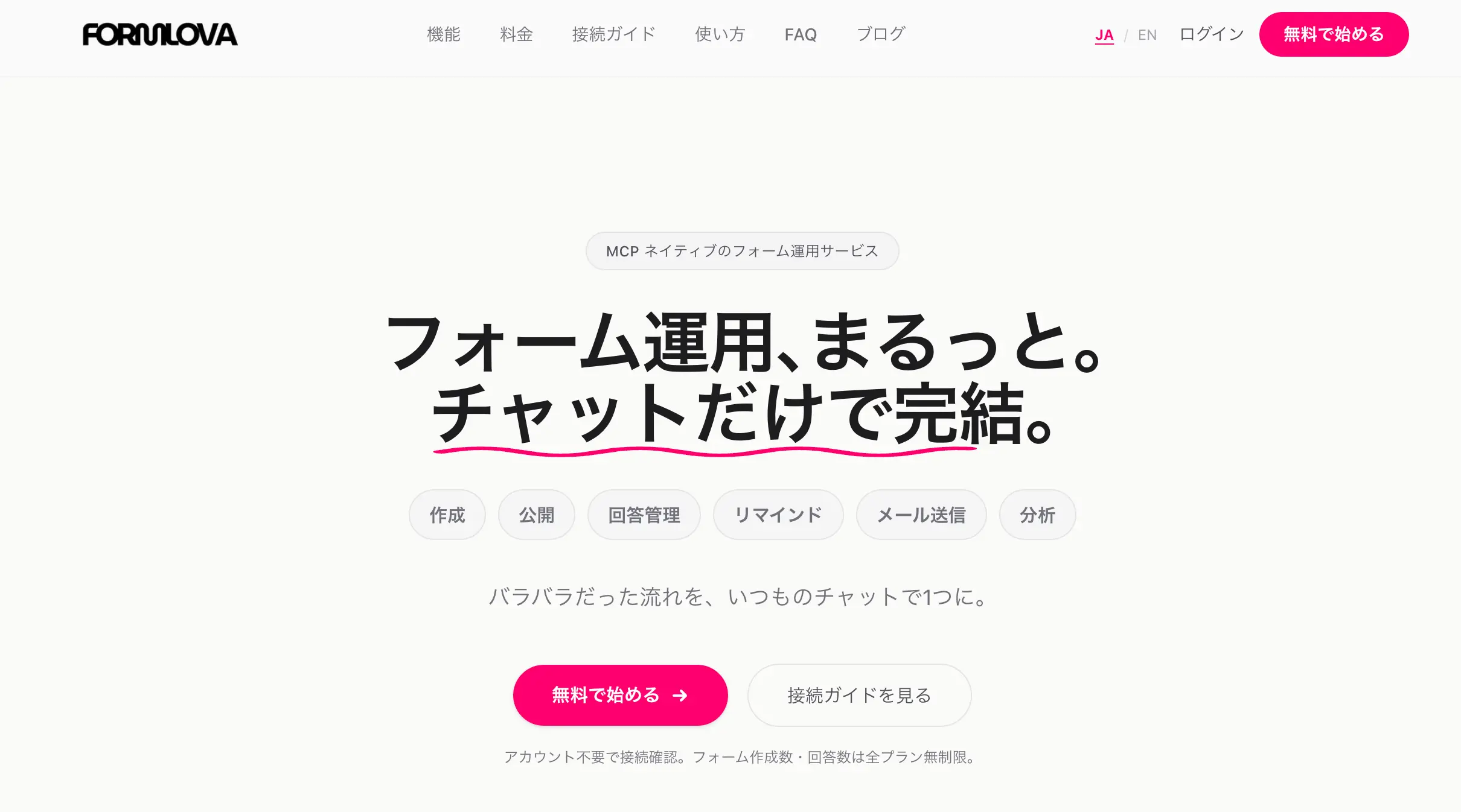
This is the existing Japanese-language reference image, not a newly captured English form or a new execution result.
FORMLOVA Explains What It Read
What I like most in this example is that the response did not stop at "Done."
FORMLOVA described what it read from the screenshot before applying the design. In this case, the response highlighted the following:
- background color: off-white
#F5F4F0 - text color: near-black
#1A1A1A - accent color: vivid pink
#FF1F6E - font direction: bold gothic-style Japanese UI typography
- overall mood: minimal and clean
That explanation is important.
It means the adjustment is not a black box. You can see how FORMLOVA interpreted the screenshot, and if the interpretation is slightly off, you immediately know what to correct. You can say things like:
Make the pink softer
Use a lighter type feel
Keep the same tone but add more whitespace
The point is not just that the form changes visually. The point is that the interpretation becomes visible enough to continue the conversation productively.
The response also returned a preview link right away, which is the correct next step. Design work is easier when the system explains what it saw and then immediately shows the result.
The Preview Feels Much Closer to the Reference
Once the updated preview opens, the difference is easy to notice.
In this example, the form shifts toward the landing page style in several visible ways. The background becomes off-white, the text becomes darker and cleaner, the primary button turns vivid pink, and the typography is adjusted toward Noto Sans JP. The end result feels much more aligned with the FORMLOVA page than the default draft did.
That does not mean the form becomes an exact clone of the landing page. It should not.
A landing page hero section and a form UI do different jobs. A landing page is built to communicate brand and direction. A form is built to support input and completion. So the right goal is not "pixel-perfect identity." The right goal is "clear visual consistency."
And that is what this preview achieves.
When you look at it, it feels like part of the same product family. The form still behaves like a form, but it no longer feels visually disconnected from the page that led the user there.
That is the level of alignment most teams actually need.
Compare the same draft before and after the change
Keep the initial preview for comparison, then inspect the updated version of that same form. The following trial is separate from the landing-page observation above and has not been executed for this revision:
Create an unpublished inquiry form with name, email, and inquiry details. Show its standard-design preview first. Do not publish it.
After reviewing the first preview, attach a screenshot of a page you are authorized to use. Remove personal or confidential information from the image before sharing it.
Match this draft's background, typography, and button styling to the attached landing-page screenshot. Keep the fields unchanged. Flag unreadable colors or an unknown font instead of forcing an exact match. Show the changes and a new preview.
| Comparison | What to inspect |
|---|---|
| Background and text | Questions and typed values remain readable |
| Button | It is distinct from the background and its label is readable |
| Fields | Labels, required settings, and order have not changed |
| Type and spacing | Long mobile labels fit and desktop spacing remains useful |
| Font | A supported or fallback font gives a natural result |
Draft creation and design changes are available on the free plan. Screenshot interpretation also depends on an AI client that can process the image; its access conditions and fees apply. Exact layout reproduction and identification of every screenshot font are not guaranteed.
Compare your landing page with an inquiry-form draft
Create a draft for free, use a screenshot to guide its colors and button styling, and compare the previews for both visual consistency and usability.
Sign up free to try screenshot-based form styling
Register, verify your email, and connect FORMLOVA to a supported AI chat. Create the draft first, then attach the screenshot and use the second prompt. Preview submissions are not saved.
Think in Terms of Matching the Mood, Not Copying the Screen
This is the main caution I would include in the guide.
FORMLOVA can get surprisingly close from a screenshot, but "close" is the right word. It is better to think of this feature as mood matching, not exact duplication.
Why? Because the reference and the target have different responsibilities. A homepage hero can use different spacing, composition, and emphasis than a form that needs to be readable, fillable, and easy to submit. FORMLOVA translates the visual direction into a form-friendly UI rather than forcing a literal copy.
That is a good thing.
When framed that way, the result in this example is very strong. The off-white background, black text, vivid pink call-to-action, and clean type treatment carry over clearly. The preview feels aligned without becoming awkward as a working form.
And if you want to push it further, the next adjustments can still stay lightweight:
Add more whitespace
Tone the pink down slightly
Make the heading feel more branded
That is the ideal pattern. Use the screenshot to establish direction, then use short chat follow-ups to fine-tune the result.
This Is the Easiest Workflow to Start With
If you want to try this yourself, the flow is simple.
- Create a draft form first
- Send the screenshot you want to reference
- Ask FORMLOVA to match the form design to that screenshot
- Review the extracted design traits
- Open the preview and make one or two short follow-up adjustments if needed
That is enough to get a form much closer to your site, campaign page, or event page without writing a full design brief.
This is especially useful when the form should feel native to an existing page rather than standing apart from it. It helps reduce visual friction and makes the overall flow feel more coherent to the user.
If you are unsure what to type first, this is enough:
Match the form design to this screenshot
Compare colors, required markers, and the button before and after the change, then refine one issue at a time. Review the form and completion page before moving to publish review. Custom auto-reply configuration is a separate Standard-or-higher workflow.
Related Articles
-
Most Form Tools Stop at Creation -- FORMLOVA Starts After Publish
-
Export Responses to CSV or Sync Them to Google Sheets with FORMLOVA
Disclosure and Verification
This article is part of the FORMLOVA product blog. The author is the developer of FORMLOVA. On October 15, 2026, the client-side screenshot interpretation path, supported fonts, preview, and plan definitions were rechecked. The earlier landing-page observation is retained; the new prompts are proposed inputs and have not been executed for this revision. For privacy, hiring, legal, medical, or financial workflows, follow your organization's policies and specialist review.
